Hot or Not
methodology
data-literacy
maps
Like many leisure cyclists, I’m a big fan of Strava and have used it for many years. I’ve been thinking about how useful their heat map feature might be for active travel planning. Here’s a screenshot for Inverness:
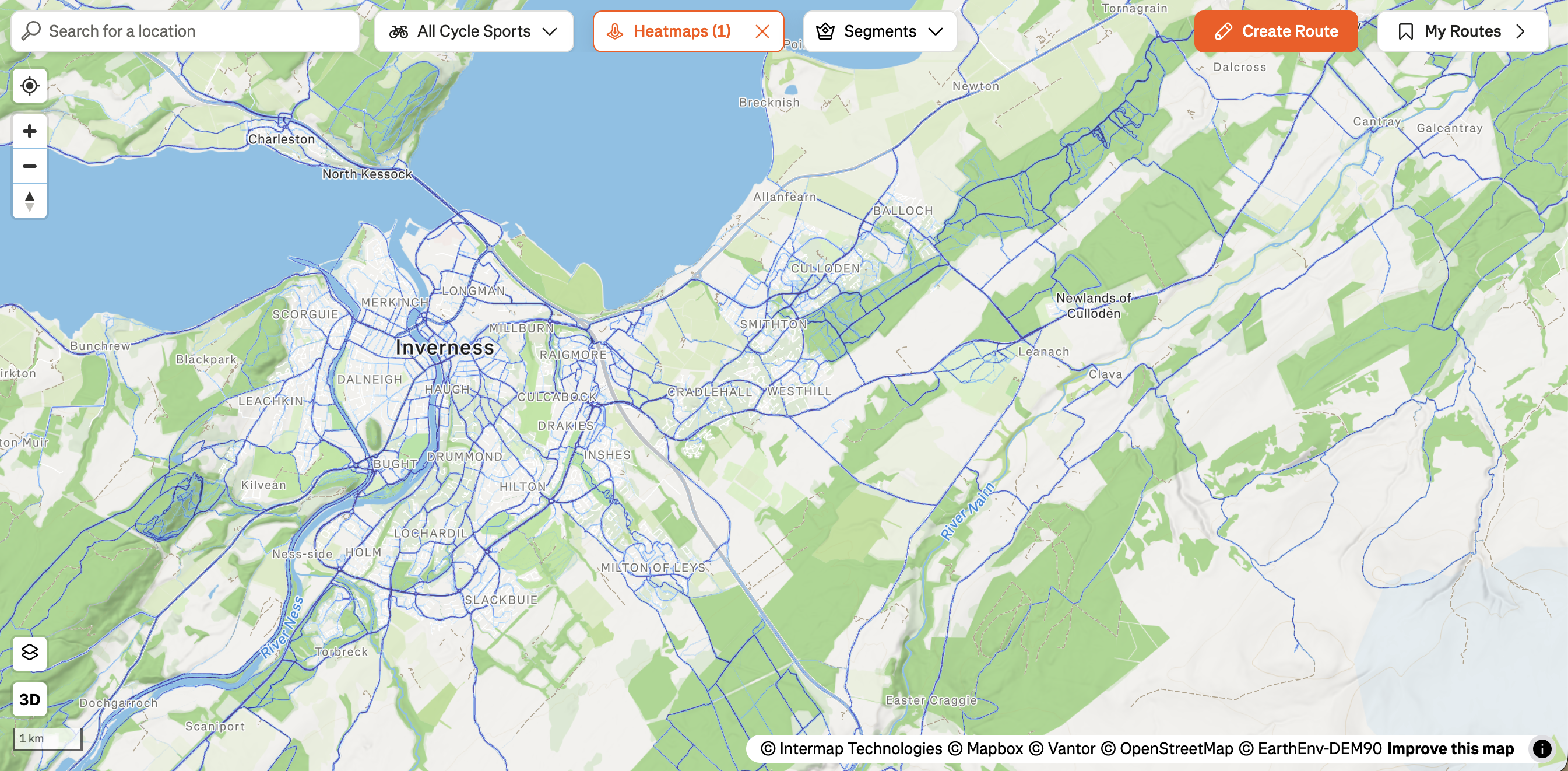
At first glance, it seems to contain a lot of useful information but an experienced local rider might see some artefacts that point to shortcomings in the data for active travel. There are many areas that appear to be busy corridors (eg the A82 to the SW, the Newlands of Culloden road to the E) with just as much traffic as the city centre. Here’s what this highlights:
- The heatmap only includes Strava users, which introduces a huge selection bias. The group skews towards sportier, more dedicated riders. If your aim as an active travel planner is to get more new riders on bikes then this demographic isn’t who you need to hear from the most, it’s the people who cycle rarely that you’re hoping to convert.
- Utility cycling is under-represented in the Strava data. This is partly a function of the previous point, but also what Strava users are likely to record on the service. To give a personal example, I’ll record my weekend club ride but I’m not turning on a GPS device to record the school run or a trip to the shops.
- The heat map shows relative popularity, not absolute counts, and as far as I can tell is not time bound in the same way as a traffic count. The A82 is a perfect example here - as a fast trunk road with poor sight lines, cycling on it is at best unpleasant and at worst outright dangerous. Except, of course for one day each year when it is closed to motor traffic to accommodate ~6000 riders completing the Etape Loch Ness event. Not the most reliable signal on which to base active travel decisions.
There is a service provided by Strava, called Strava Metro that allows planners more granular access to their datasets. Based on their FAQ page, it seems they’ve done some smart stuff to address the concerns I have and their testimonials page is brimming with successful case studies. It does indeed look like a good service but they seem to be geared towards big organisations. I’ll apply for a free account but I’m not sure if ‘curious guy with a blog’ will meet their criteria.
In the meantime, I thought I’d try and see if I can make a useful heat map from the data I have available to me. I turned again to Cycling Scotland’s data portal for some open source goodness. To try and capture the popularity of routes, I decided to plot a faded circle around each counter on the map and then trim the circles to show only where they overlap roads and paths. The size of each counter is determined by the median cycle count for the last 3 years, with the hope that the more popular counters would ‘radiate’ towards each other, thus highlighting popular routes. Here’s how it looks:
To my mind, this is one of the worst kinds of data visualisation because it looks a lot more informative than it is on first glance. Look! There’s big hot spots in the city centre and next to Raigmore Hospital! That’s where people cycle! It’s easiest to realise the shortcomings of this representation by looking at a simpler version:
Looking at these maps side by side it’s a bit clearer what Figure 2 shows - it’s not a heatmap of where people cycle, but a map of where cycling is measured. This becomes really misleading because the map makes it looks like nobody is cycling in areas like Kinmylies, Merkinch and Culduthel but the reality is that the data behind it tells us nothing about cycle traffic in those areas. It also makes the traffic look high in every direction around a popular counter - this masks the crucial route choice information that is needed when thinking about where people want to ride. It’s also effectively inventing traffic data in streets that aren’t measured.
All this is not to say that the counter data is of no value. They’re great for measuring seasonal trends, measuring the impact of interventions or even assessing the historical utility of existing infrastructure. Collecting enough data for a useful heatmap with these types of sensors would require a very dense, comprehensive network of detectors so that gaps in the data are minimal. I suspect this would be a very expensive undertaking.
For me, this has still been a useful exercise. It’s reminded me to think about what isn’t being measured whenever I’m looking at a dataset to make sure I don’t over-interpret what’s there. It’s also been instructive to see how, by adding complexity to a data visualisation you can appear to show effects that aren’t real.